
You have your website’s branding nailed down with a snappy logo, a perfectly engineered tagline, and stunning design. Does that sleek look carry over to your brand’s Facebook Page and other social media properties?
Branding is a big process to undertake and consistency between platforms is critical. Now is a great time to review your graphics and make simple tweaks to ensure your branding is top-notch across Facebook and other platforms.
Facebook Page Profile Picture: Logos
Brands often select their own logo as the default profile picture for all social media accounts. Smart move, incorporating the logo adds to brand awareness and solidifies identity. Obviously your brand logo needs to be sharp when displayed on both desktop and mobile devices. It’s about first impressions.
With that being said, THINK SQUARE. Be sure to secure a 180x180px (displays 160×160) version of your brand’s logo for proper Facebook display.
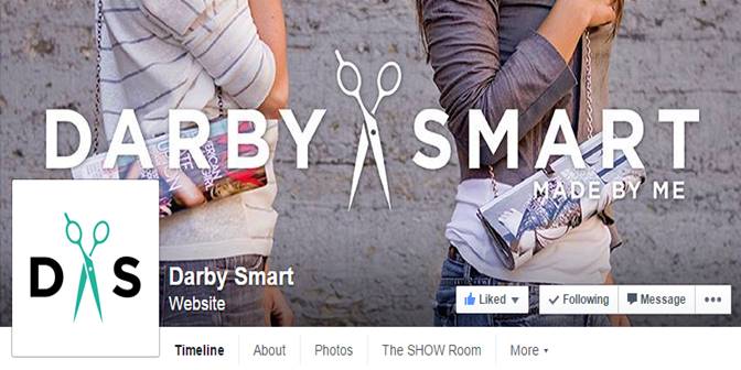
Darby Smart made a smart move by taking their very horizontal website logo and condensing it to a simplified square graphic on their Facebook Page.
Website: ![]()
Facebook Page:
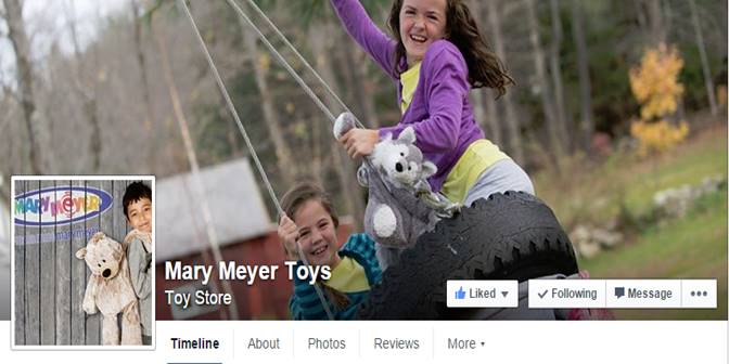
Darby Smart nailed it, unfortunately many brands fall flat. As you can see below, this profile picture displays unreadable text and too much empty space. Mary Meyer Toys could easily remedy this situation by simplifying their colorful logo and placing it on a white background. As you can see, the minimized view doesn’t quite register to the eye.
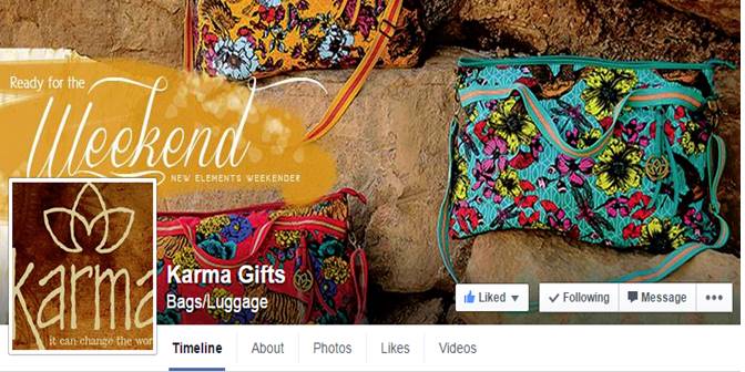
Another really common issue is losing a piece of the brand logo in the margins, as displayed by Karma Gifts. Reformatting would save this logo from the edge.
Facebook Post Pictures
Alright, now that basic branding has been covered, let’s talk Facebook Page post photos.
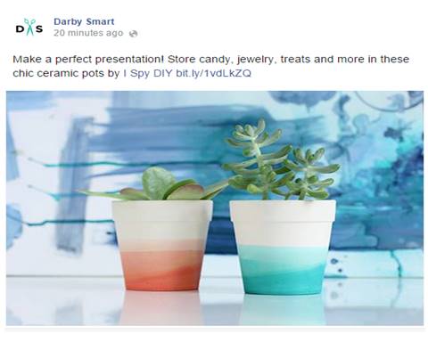
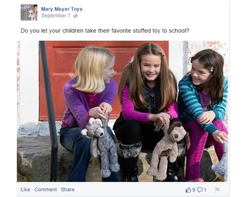
- Keep photos clean and simple. Clutter is a big no-no.
- Select light and bright images.
- Avoid clogging graphics with too much text and an overabundance of logos. (Facebook has a 20% rule when it comes to how much text can be within an image.)
- Don’t bother with “Call to Action” buttons. They aren’t clickable within Facebook, so why go there?
- Salesy graphics bomb when it comes to attracting eyeballs. Don’t recycle sales materials for social media consumption.
Note: These little rules also apply to link posts, so be mindful of what image pops up as the thumbnail. Facebook allows you to upload an alternate image in its place. (A strong horizontal image is optimal.)
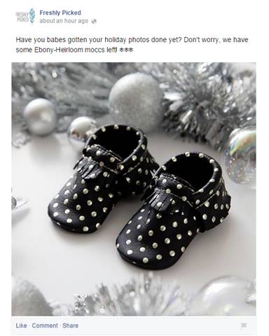
Freshly Picked knocks the picture post out of the park. Leather moccasins for babies and tots ooze sophistication and delight in every post. If you haven’t already, check out their Facebook property to view a really lovely and thriving Facebook brand-fan relationship.
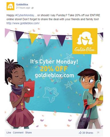
GoldieBlox strikes the right balance between promoting a special event and remaining visually pleasing. Another Facebook Page to watch for inspiration.
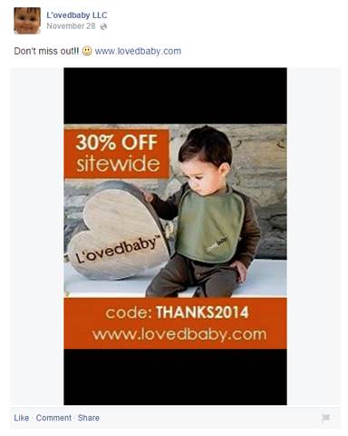
L’ovedbaby LLC had good intentions, but really should have created an alternate graphic for this promotion.
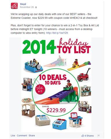
Step2 gives us an example of cramming in too many products into one graphic. Less is more.
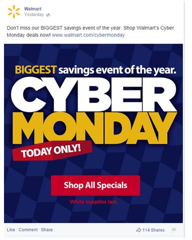
Walmart incorporated a “Shop All Specials” button into this image. When clicked, fans are just taken to a larger view of the post itself.
Now that you have live examples to review, how does your Facebook Page compare? The purpose of this exercise is not to embarrass the brands used as ‘bad’ examples, but to point out fixable common mistakes.
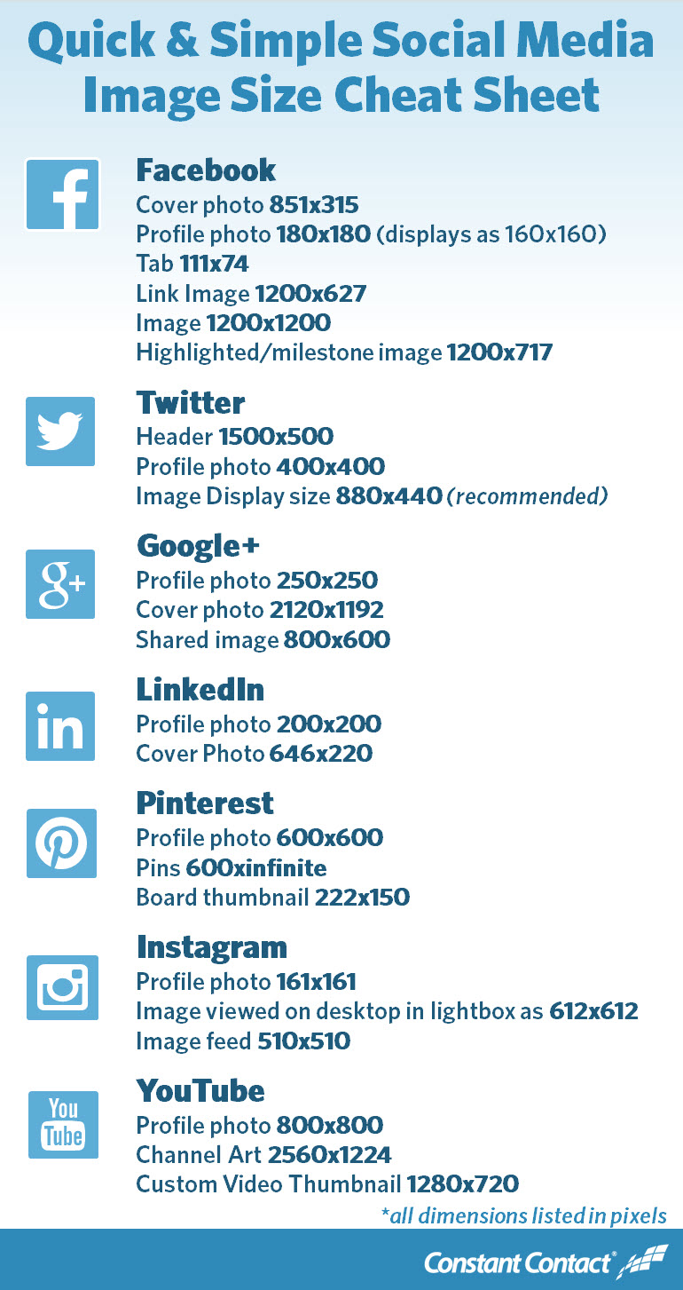
Once you get your brand’s Facebook situation squared away, turn your attention to your other properties on Twitter, Google+, etc. This cheat sheet covering image dimensions from Constant Contact can serve as your guide moving forward!
Remember, dimensions change often and research should be done before creating new branded graphics.
What is Social Rank?
SocialRank is a proprietary algorithm built on top of the our content platform that gives a holistic view of all social engagement (such as likes, comments, and shares) for published content across the web.